
🌍
English


Tag: mobile
(5 extensions)


Revision 2.5.22 (2024-04-24)
- Authors: hannah, teekay
- Categories: Theme
- Tags: video, mobile, slideshow, responsive
- Available languages: 22 (see)
- Compatible with: Piwigo releases 14
- Downloads: 315956
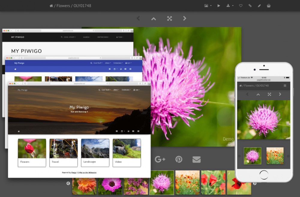
About: A feature-rich and mobile-ready theme based on Bootstrap 4.
Features:
* Over 30 color styles
-> Bootswatch
-> Material Design
-> Custom low-contrast dark color scheme based on Lightroom® colors
* Full screen slideshow view using PhotoSwipe
-> Supports auto play
-> Supports HTML5 video
-> Album thumbnails can be linked to PhotoSwipe directly (like smartpocket)
* 100% mobile ready
-> fully responsive Navbars, Carousel, PhotoSwipe slideshow, video content
-> async/ondemand loading of carousel & PhotoSwipe content, adaptive image size selection, swipe & tap events
* Carousel album navigation on the picture page using Slick slider
* Video support using native HTML 5 video widget
* Optional hero image or jumbotron banner
* Different layouts for infos on picture page
* Tons of configuration options
Requirements:
* PHP >= 5.3
Recommended plugins for best mobile experience:
* GThumb+ or gdThumb (for best "available screen space usage")
* RV Thumbnail Scroller (to keep initial page load size small and allow for easy "swipe through")
Compatible with 'User collections', 'Expiry date' & 'Batch downloader' plugins
Changes: # Update search in this set icon
# compatibility PHP 8

Revision 14.c (2024-04-24)
- Author: JanisV
- Categories: Theme
- Tags: mobile
- Available languages: 34 (see)
- Compatible with: Piwigo releases 14
- Downloads: 52374
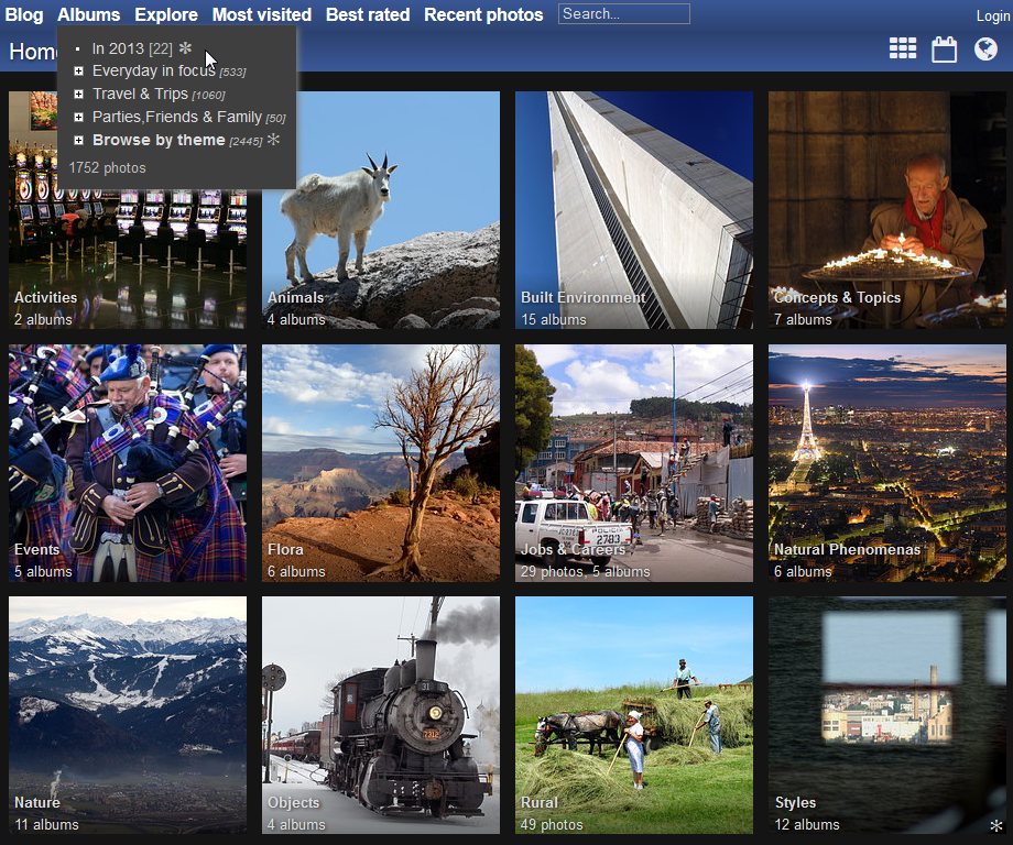
About: 'Stripped' theme with responsive thumbnails.
Vertical menu adapted for mobile devices and small screens.
Looks perfect with Fotorama, Menu Random Photo, GThumb+ and RV Thumb Scroller plugins. Smart Pocket theme should be disabled for activate this plugins on mobile.
Changes: compatibility PHP 8.2 (syntax error)
Revision 14.4.0 (2024-04-17)
- Author: rvelices
- Categories: Theme
- Tags: mobile, responsive
- Available languages: 43 (see)
- Compatible with: Piwigo releases 14
- Downloads: 230929
About: - responsive layout, retina aware
- comes with several color flavors (including clear and dark colors)
- horizontal menu (becomes vertical on mobile devices and small screens)
- automatic photo size selection on photo page (retina aware, graceful degradation on non javascript browsers, active from the first hit ...)
- thumbnails full row layout (no space lost, à la plugin GThumb, retina aware)
Incompatible with the following plugins: AutomaticSize
Changes: same as Piwigo 14.4.0
New languages:
* Cambodia (ខ្មែរ [KH])

Revision 12.a (2021-12-21)
- Author: julien1311
- Categories: Plugin
- Tags: mobile
- Available languages: 24 (see)
- Compatible with: Piwigo releases 14, 13, 12
- Downloads: 32947
About: Allow to apply the mobile theme by default for tablets
Changes: Compatibility with Piwigo 12
Revision 0.7 (2018-10-25)
- Author: lexming
- Categories: Theme
- Tags: mobile, modern, responsive
- Compatible with: Piwigo releases 2.9
- Downloads: 12466
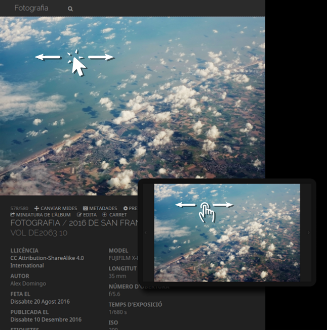
About: Versa is a responsive dark theme for modern browsers that maximises the visualization of photographs. The picture page adapts to the browser window and the photograph is displayed using the largest available space. Therefore, this theme works in both mobile and desktop and allows to easily browse the gallery with fullscreen pictures by rotating the screen or resizing the window.
- In landscape mode (or wide windows) the photograph fills the screen. The information and comments of the photograph are accessible by scrolling the page.
- In portrait mode (or tall windows) the top part of the screen shows the full image and the bottom part its information and comments.
In either mode and on both desktop and mobile, it is possible to navigate the gallery by a single swipe gesture, dragging the image with the mouse or clicking/taping the sides of the image. Slideshows adapt to the medium in a similar way, but switch the navigation to their corresponding controls.
Thumbnails on the index and albums pages are scaled to fit the browser window as well. To ensure the quality of the images shown, the pictures and thumbnails are downscaled only, never upscaled.
Features:
- Dark low-contrast theme
- Responsive design for mobile and desktop platforms
- Photographs can be browsed fullscreen in landscape mode
- Support of tactile gestures and mouse events to browse the gallery
- Thumbnails are scaled depending on the screen/window size
- Scalable graphics thanks to Font Awesome (http://fontawesome.io)
- Friendly to existing plugins and languages as it is based on the default theme
Instructions:
- Settings related to picture sizes only define the maximum size of the image in this theme, as they are dynamically downscaled to fit the browser window.
- Set the size of the thumbnails to be between 1.5x and 2.0x larger than the desired size. For instance, 400x400 will result in thumbnails around 300x300 in size (varying between 200 and 400 px). This is needed for the dynamic scaling of the thumbnails.
Disclaimer:
*Beta status* This theme was developed originally for my personal site. Even though I think it is now in a sufficiently mature state to be shared, be warned that I do not have the resources to test all possible configurations. Therefore, bugs may appear on other ends.
- Tested browsers: Firefox on Linux, Firefox on Android, Chrome on Android, Safari on iOS.
- Tested compatible plugins: Batch Downloader, Community, Exif View, PWG Stuffs, Simple Copyright, GThumb+.
Changes: Changelog from previous revision:
- Fixed hardcoded paths with capitalisation errors
- Improved compatibility with the Community plugin
- Nicer display of warning messages
(5 extensions)